ClearScore: Turning a failing embedded lending journey into a conversion win
The challenge
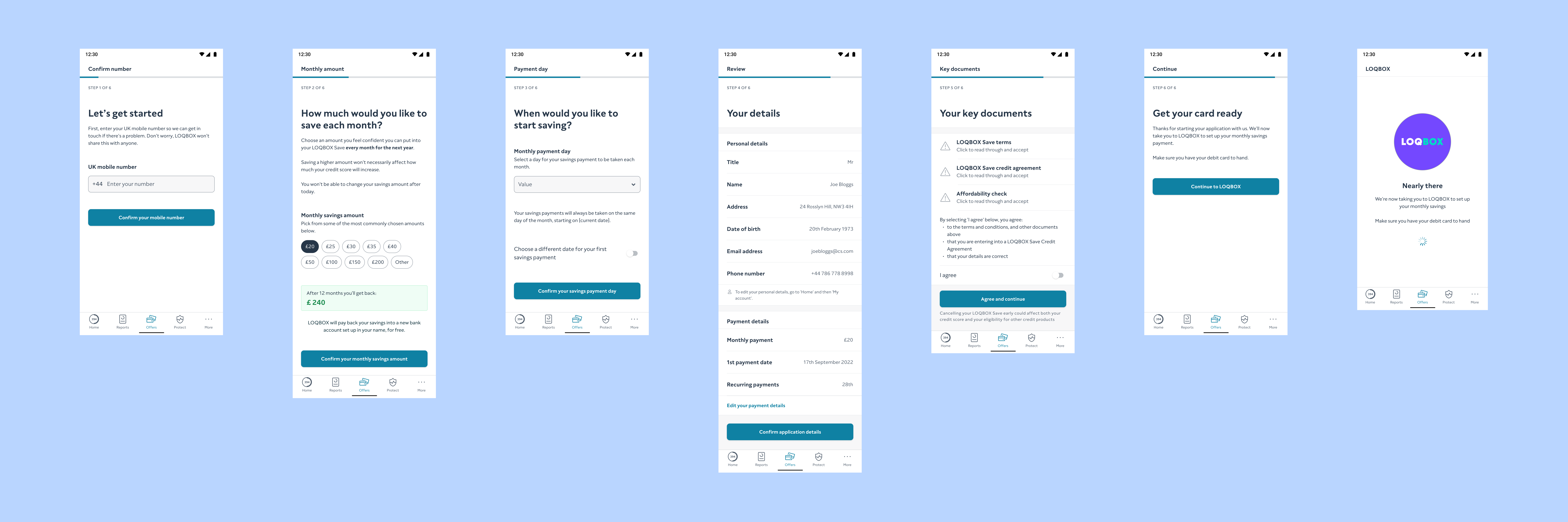
ClearScore launched a native lending journey for Loqbox to improve user experience and control. But the embedded version underperformed by 11% compared to the affiliate flow it was meant to replace. The team needed to quickly understand why the journey was failing — and redesign it under tight timelines, with limited design resources and high commercial pressure.
My role
As design lead, I took responsibility for diagnosing the issues and reshaping the journey. With minimal visual/UX design support, I led the project end-to-end — from problem analysis through to implementation. I collaborated with engineers, product owners, and compliance to ensure the solution was both effective and feasible.
My approach
Analysed user behaviour data to identify friction points and premature exits.
Reorganised the flow to better match user expectations and mental models.
Reduced friction by removing redundant questions and clarifying what was pre-filled.
Rewrote CTAs and guidance to build trust and support completion.
Partnered with compliance to ensure regulatory alignment.
The outcome
User impact
A shorter, clearer journey with fewer unnecessary steps.
Improved clarity on what information was already available from the credit report.
Stronger guidance and CTAs that built confidence in completing the flow.
Business impact
The redesigned journey outperformed the affiliate version in A/B testing.
Secured a more consistent user experience across ClearScore’s embedded lending strategy.
Demonstrated how language and flow — not just UI design — can drive conversion.
Informed the leadership decision to deprioritise this model in favour of scalable alternatives.
What I learned
You don’t always need full design resources to solve UX problems — but you do need to understand how language shapes behaviour. This project reinforced the power of content to influence outcomes under constraint.


