Revamping the Cities of Learning website for The RSA
Content Design London
Problem
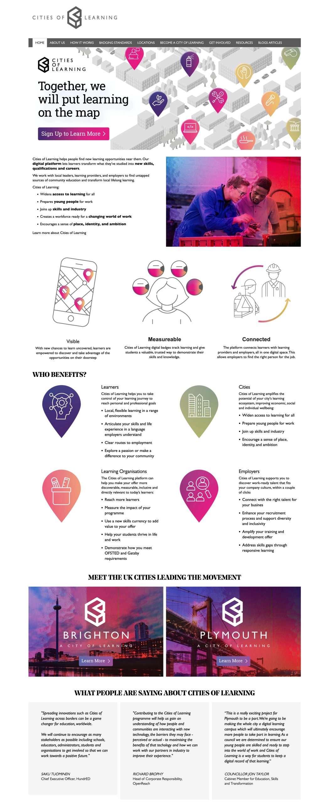
The Cities of Learning website was generating few leads, was bloated, confusing, and not effectively targeting its users.
Process
I performed a data audit and readability assessment to understand user engagement and language difficulty. I then conducted stakeholder workshops to map out user types, motivations, and how the initiative could assist them, forming the basis for new user journeys, taxonomy and content.
Solution
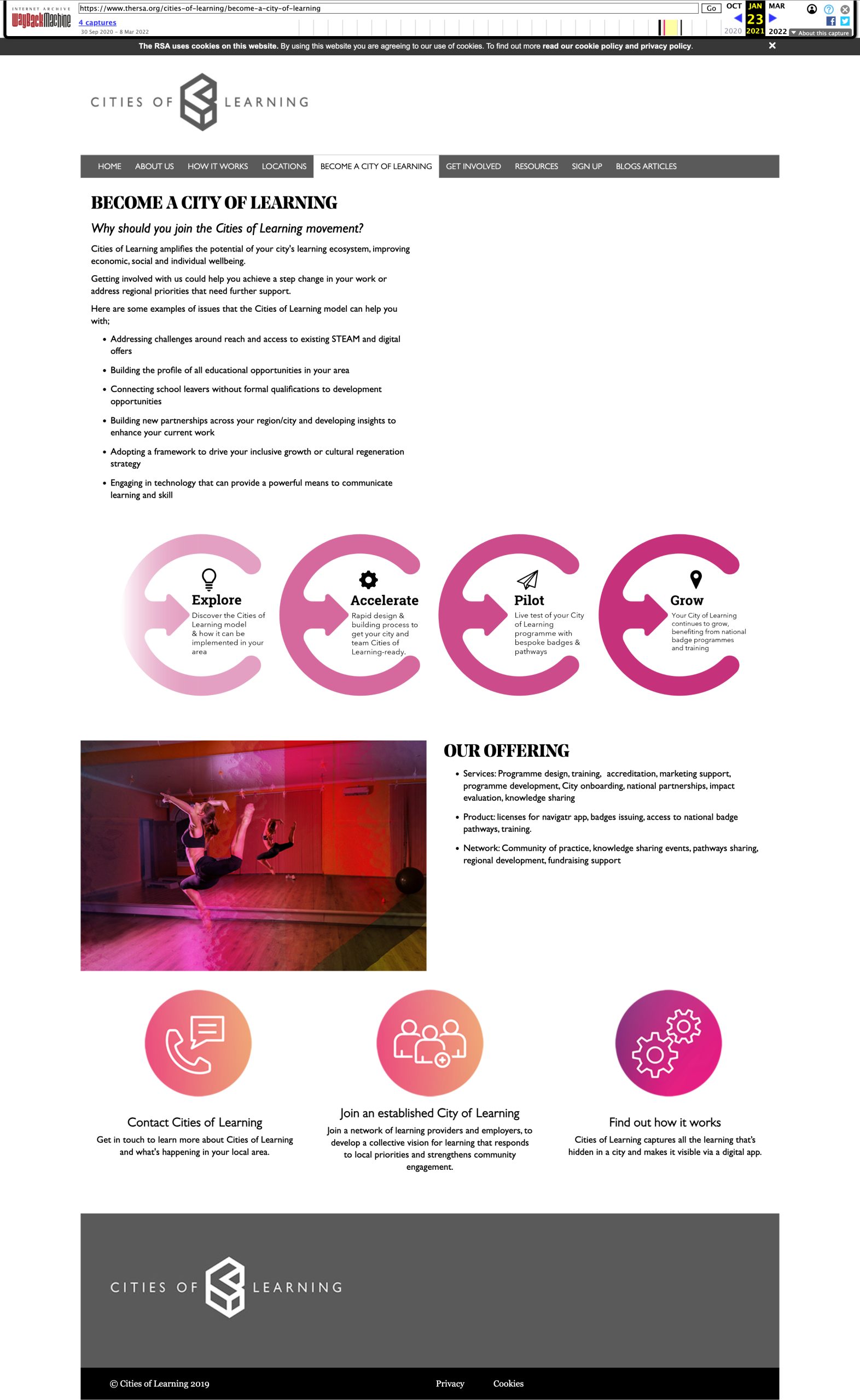
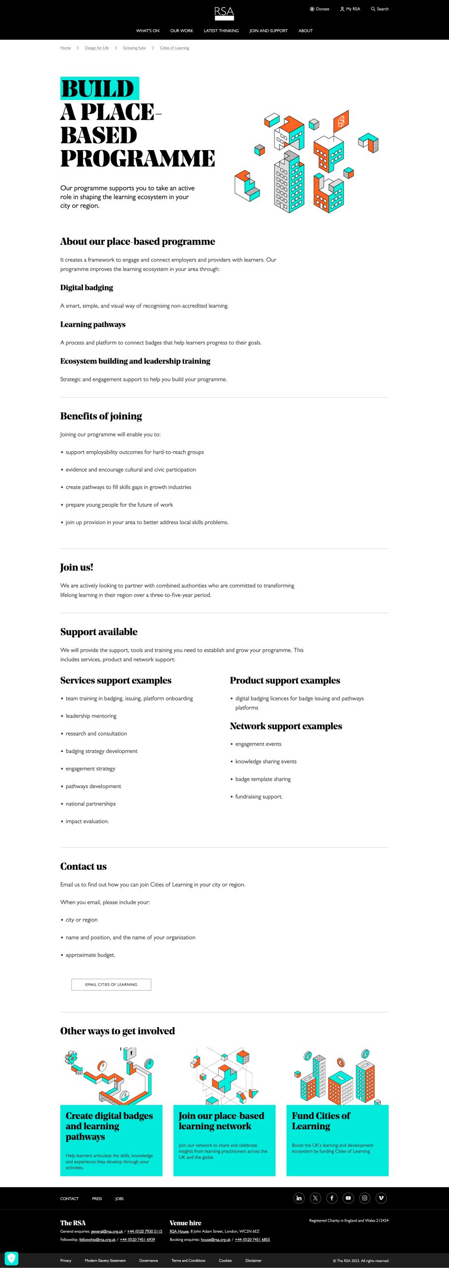
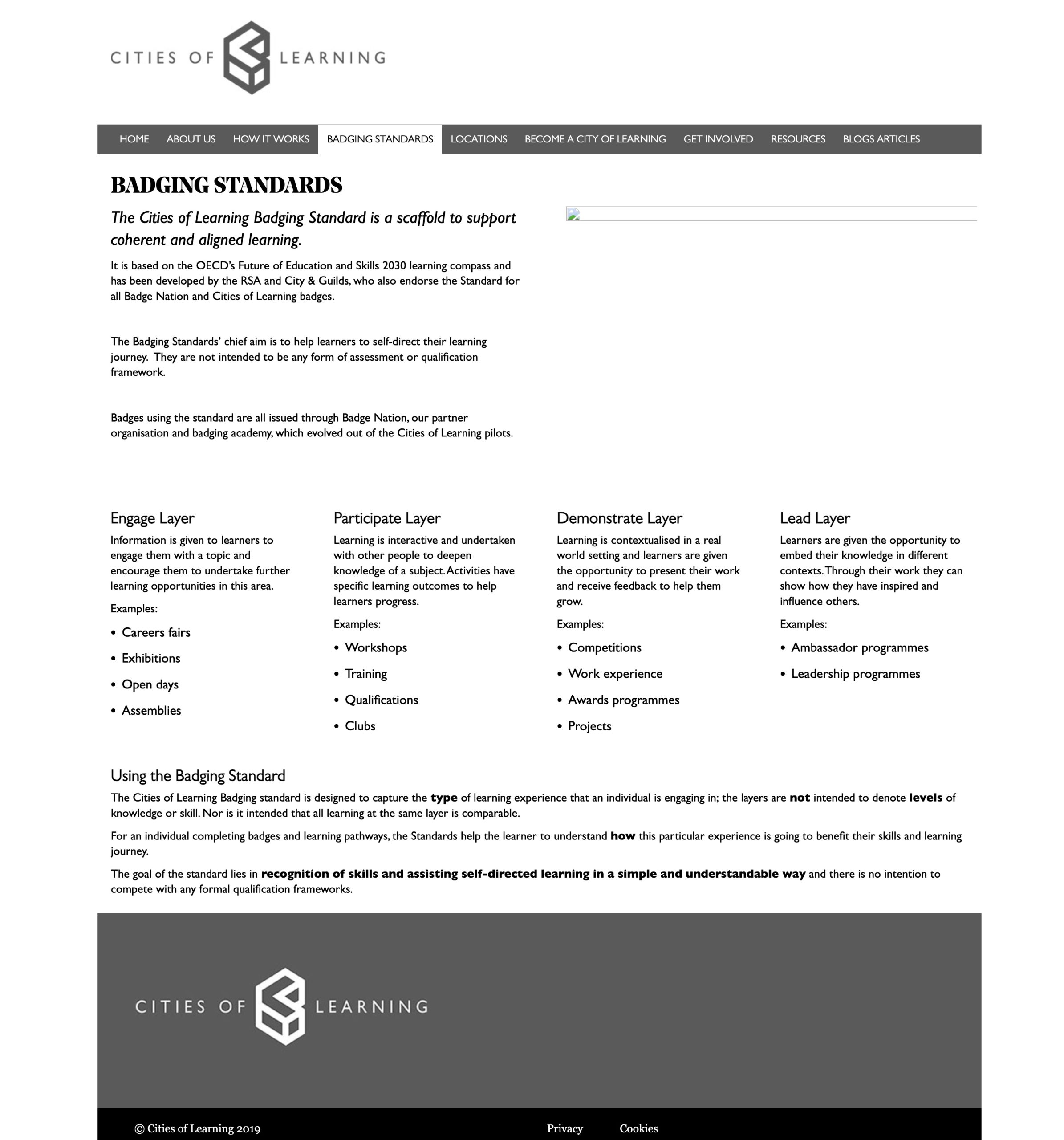
I created segmented pathways for each user type from a centralised landing page, defined content using job stories, and edited visual assets to fit the proposed CMS and layout, prioritising information over decoration.
Result
The RSA appreciated the clear communication and adherence to the schedule I planned out with them. Post-launch, the website began receiving queries from users with a clear understanding of their needs from the initiative, streamlining the communication process for future engagements.
More case studies
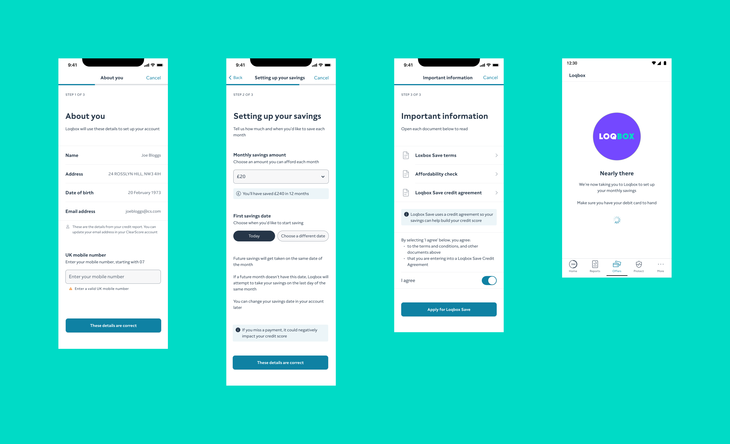
Optimising the Loqbox journey on ClearScore
Improved the Loqbox journey on ClearScore, which was initially underperforming, by simplifying the application process and enhancing user understanding.
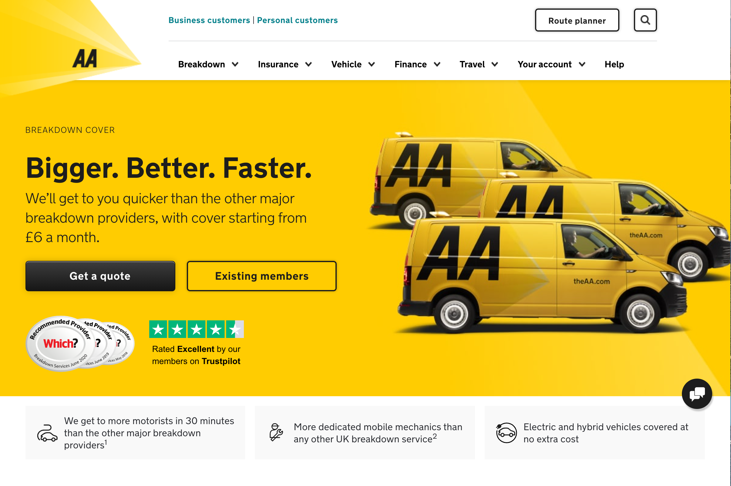
Enhancing user experience on breakdown cover landing page
Improved product conversion by 6% through user-centric redesign of the Call-to-Action (CTA) copy on the breakdown cover landing page.
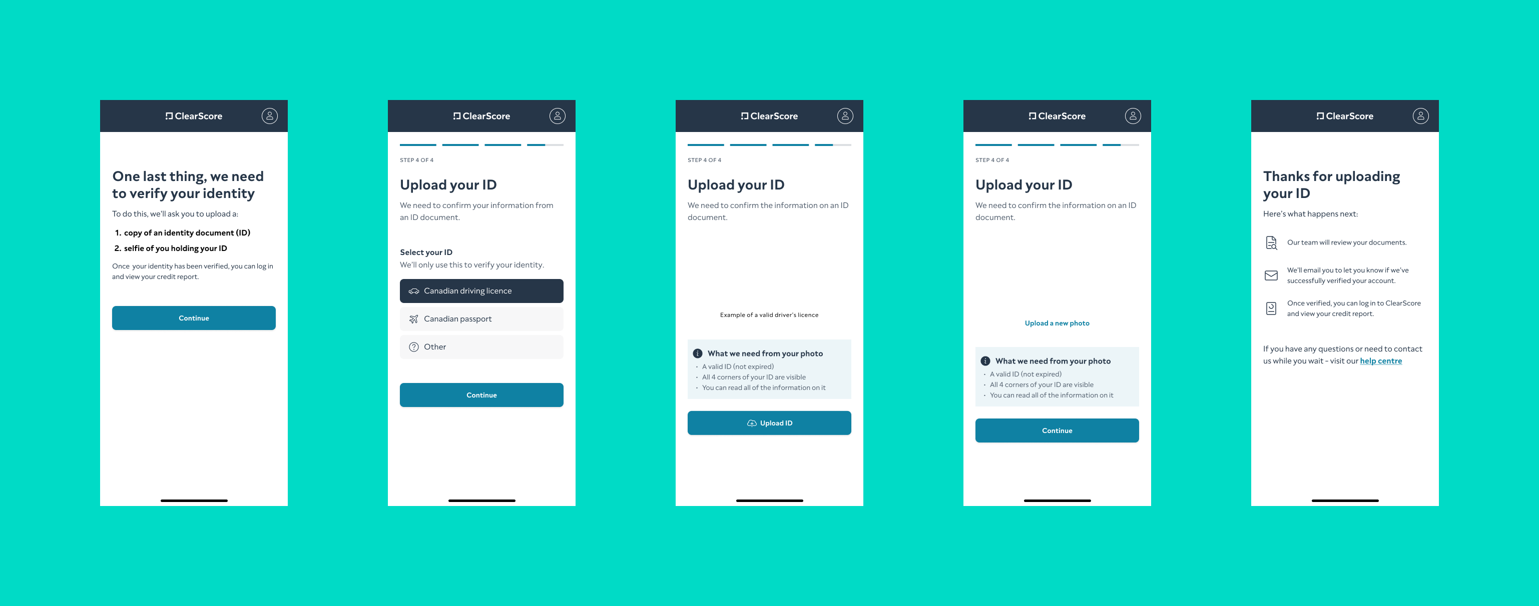
Refining onboarding for ClearScore Canada
Refined the onboarding flow for ClearScore Canada, making it more intuitive for the local user base and improving completion rates.
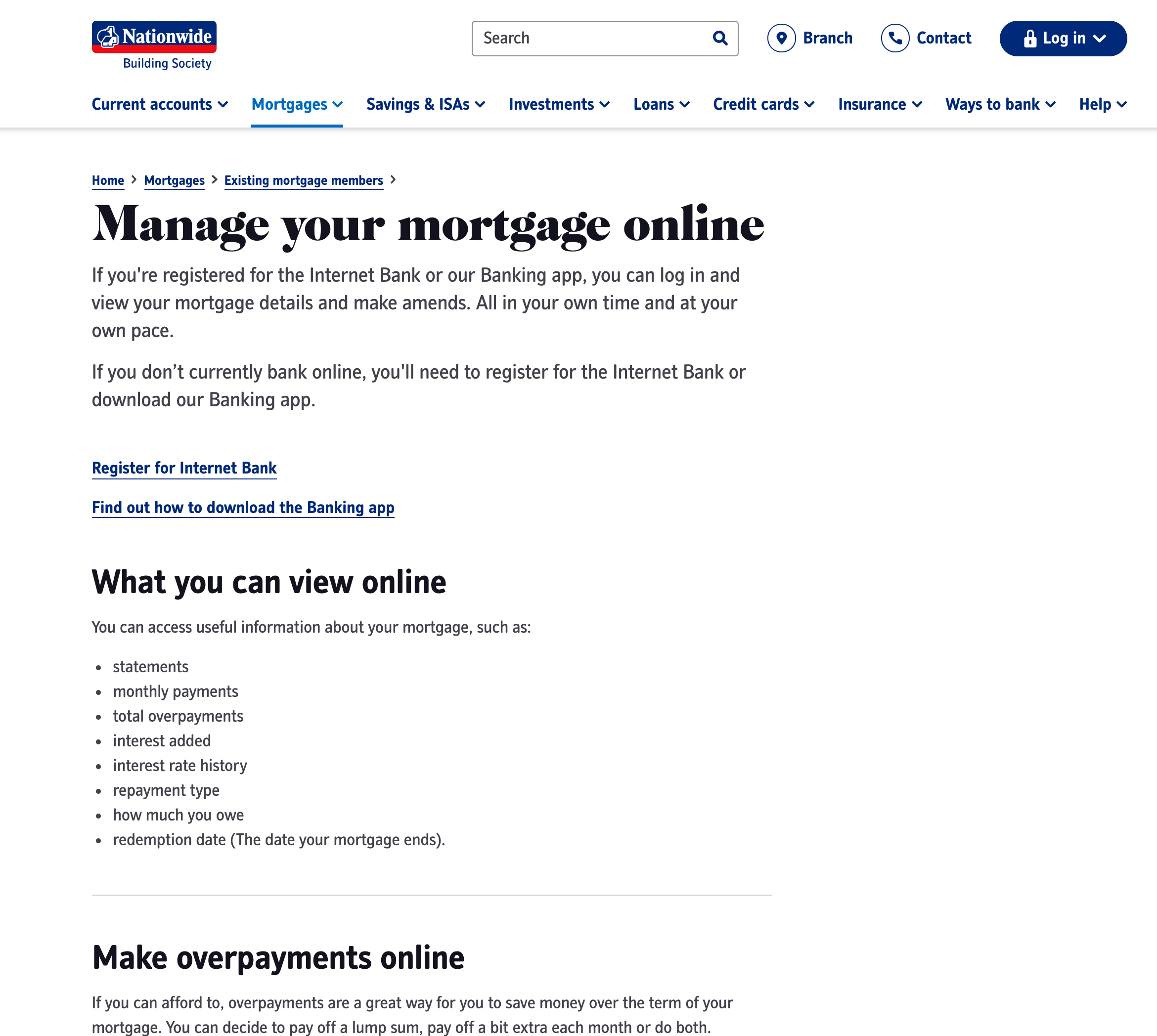
Creating a comprehensive support content framework
Developed a data-driven support content framework for Nationwide Building Society’s website, reducing call centre load and improving user experience.

