Optimising the Loqbox journey on ClearScore
ClearScore
Problem
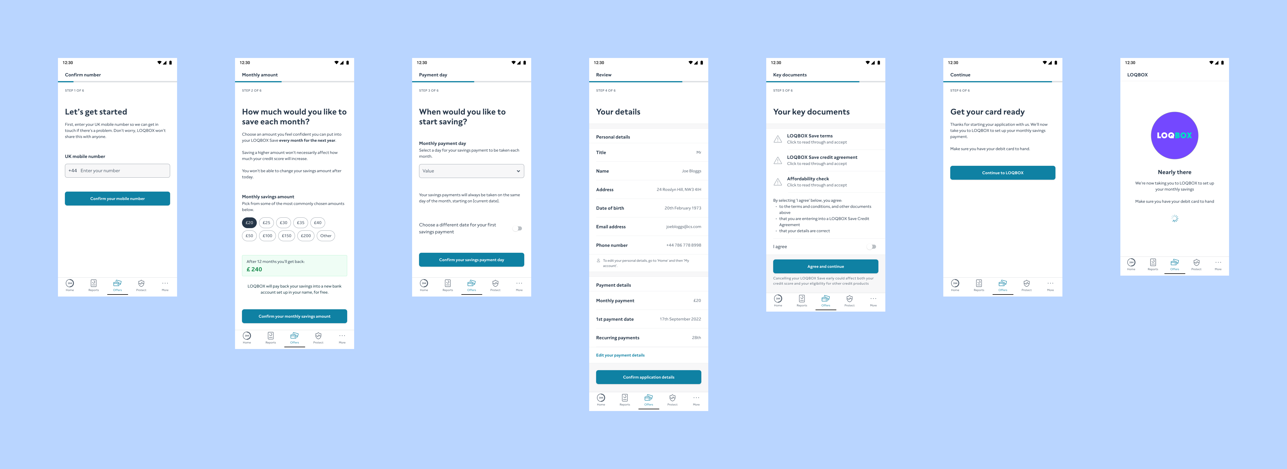
ClearScore had invested in ‘Apply on ClearScore’, which recreated partner application journeys on the ClearScore tech stack in order for us to optimise them for greater conversion.
The Loqbox journey on ClearScore was underperforming against the standard journey by 6%, leading to a decrease in application conversions.
Process
I conducted a comprehensive review of both journeys and ran several unmoderated user tests to identify pain points, with a particular focus on any friction experienced within each form and the comprehension of the content.
Solution
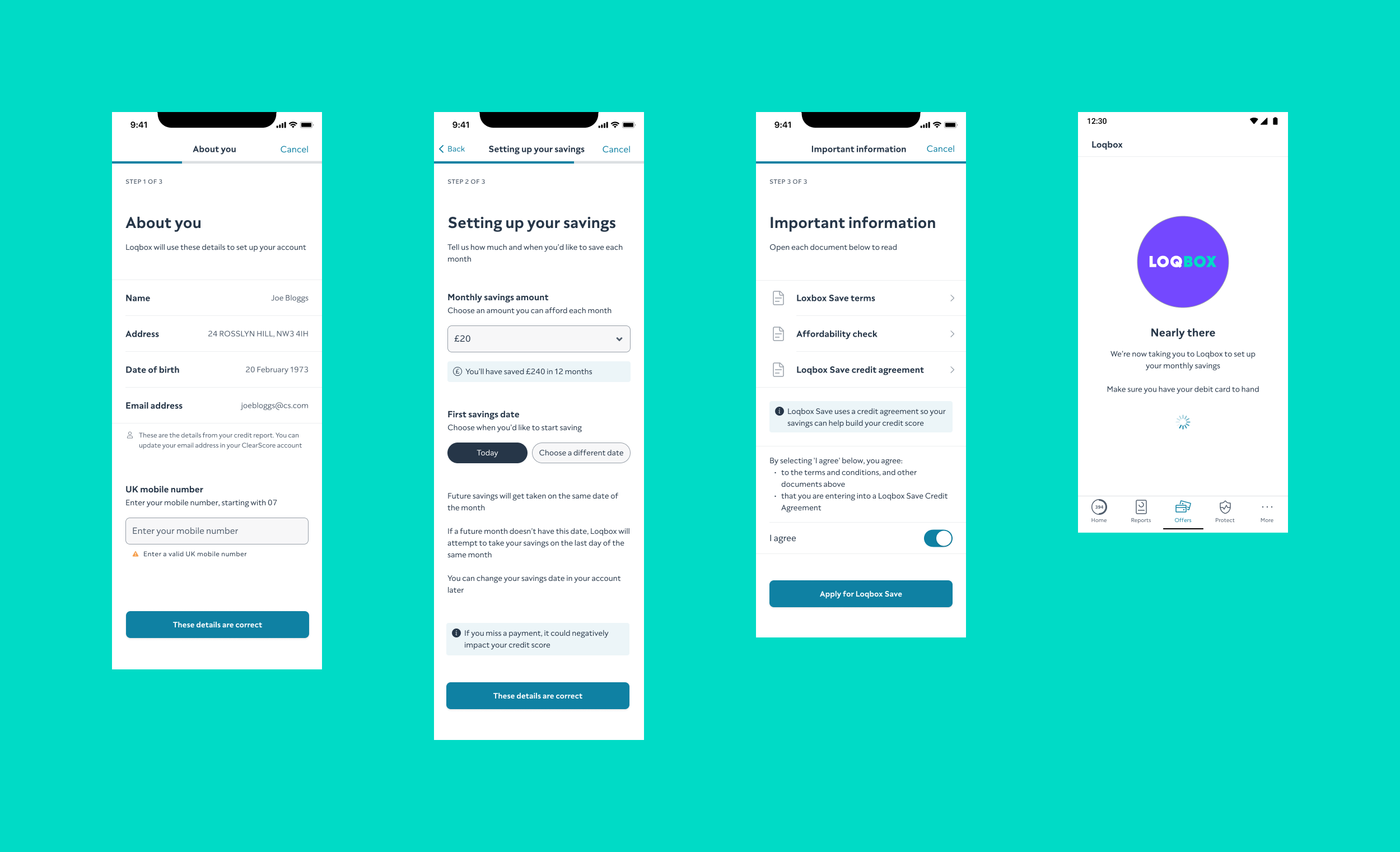
I redesigned the journey using Figma, in collaboration with the engineering team, to simplify the process and improve user understanding, while considering technical constraints.
Result
The conversion rate improved by 11%, outperforming the standard Loqbox journey by 5%, and the style guide was updated to reflect best practices for application journeys.
More case studies
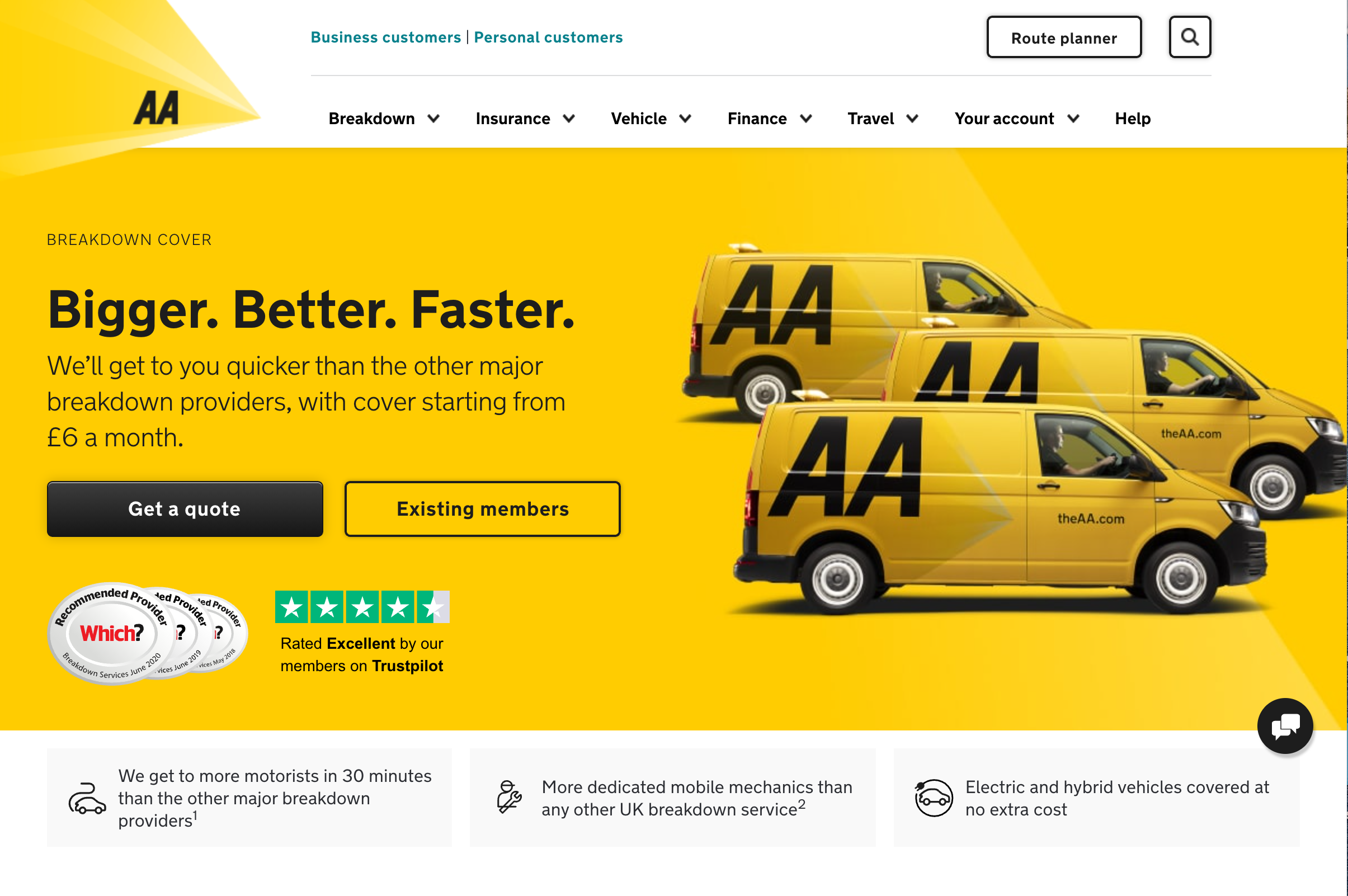
Enhancing user experience on breakdown cover landing page
Improved product conversion by 6% through user-centric redesign of the Call-to-Action (CTA) copy on the breakdown cover landing page.
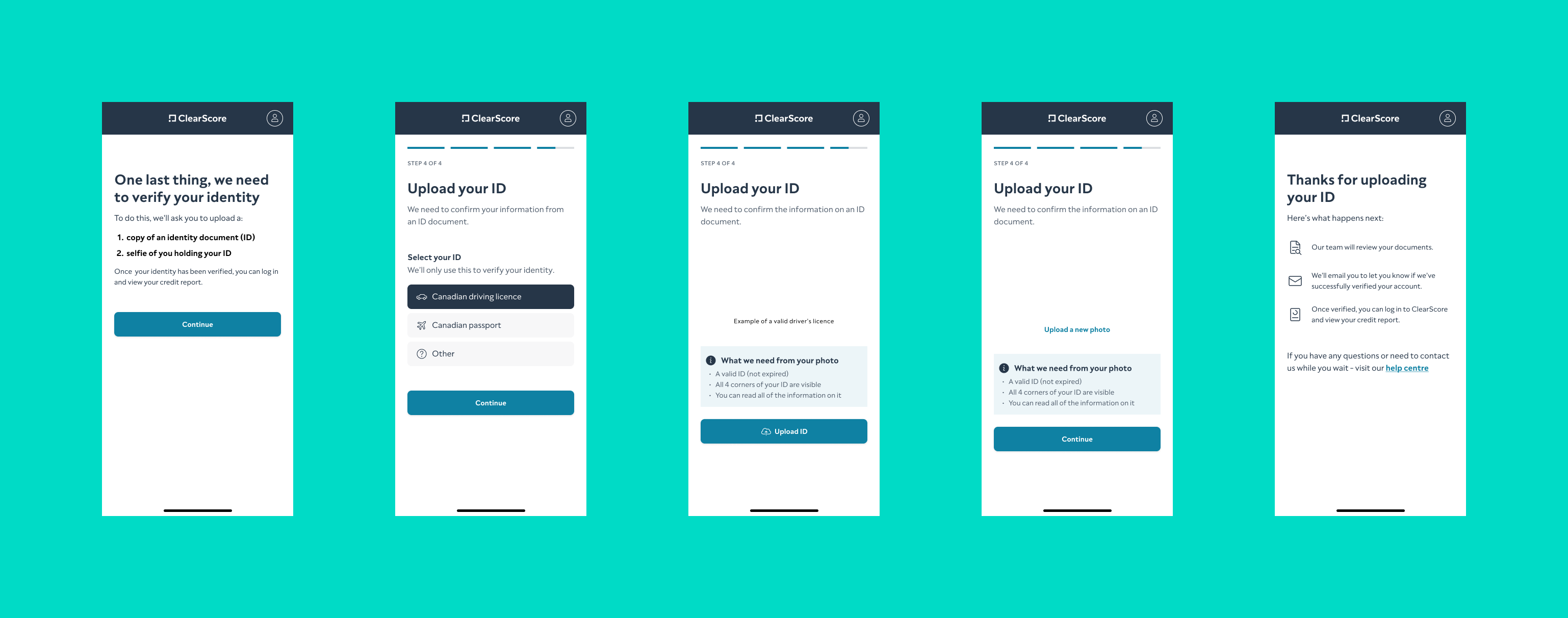
Refining onboarding for ClearScore Canada
Refined the onboarding flow for ClearScore Canada, making it more intuitive for the local user base and improving completion rates.
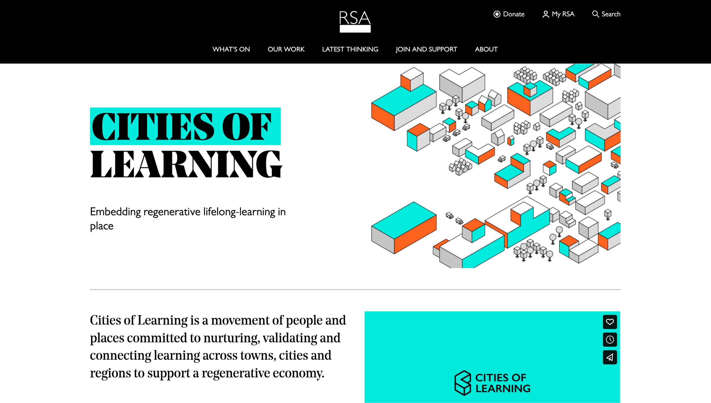
Revamping the Cities of Learning website for The RSA
Led a comprehensive website redesign for The RSA’s Cities of Learning, identifying user groups and creating tailored content to enhance user experience.
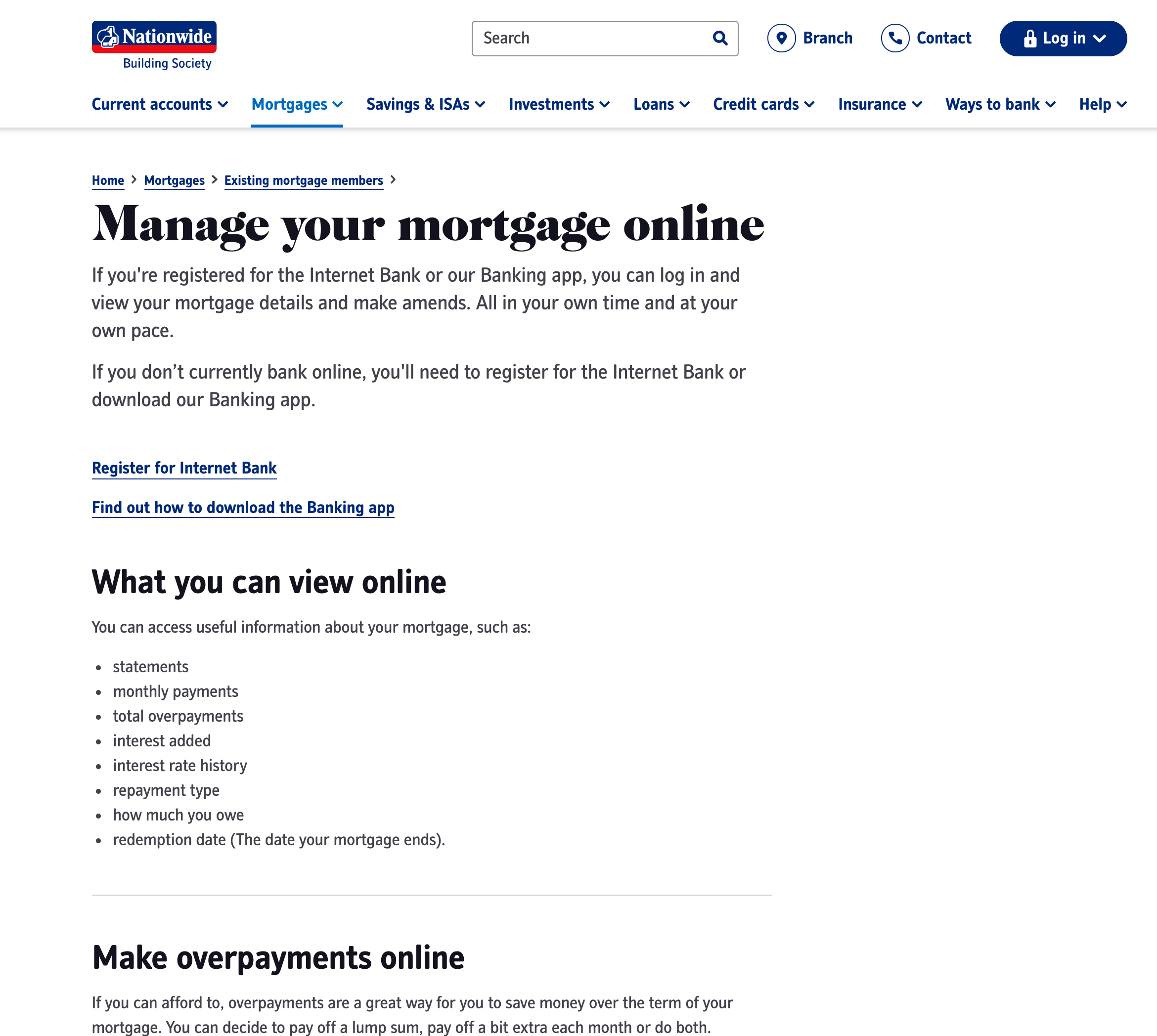
Creating a comprehensive support content framework
Developed a data-driven support content framework for Nationwide Building Society’s website, reducing call centre load and improving user experience.

