Enhancing user experience on breakdown cover landing page
The AA
Problem
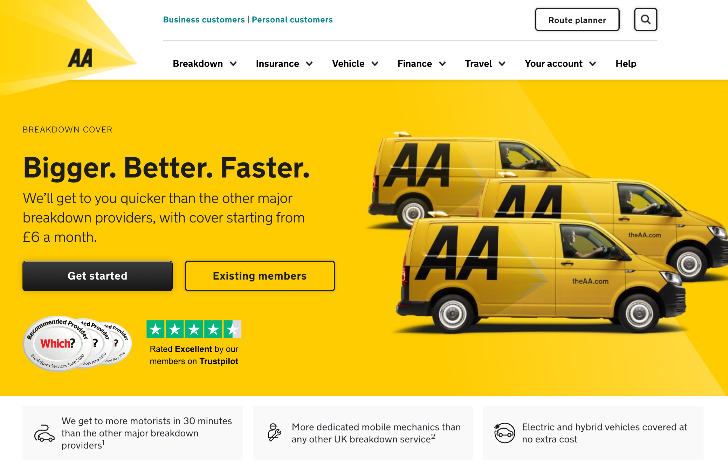
The primary Call-to-Action (CTA) on the breakdown cover landing page, “Get started,” was causing uncertainty among users, making them hesitant to proceed with the purchase due to its committal nature.
Process
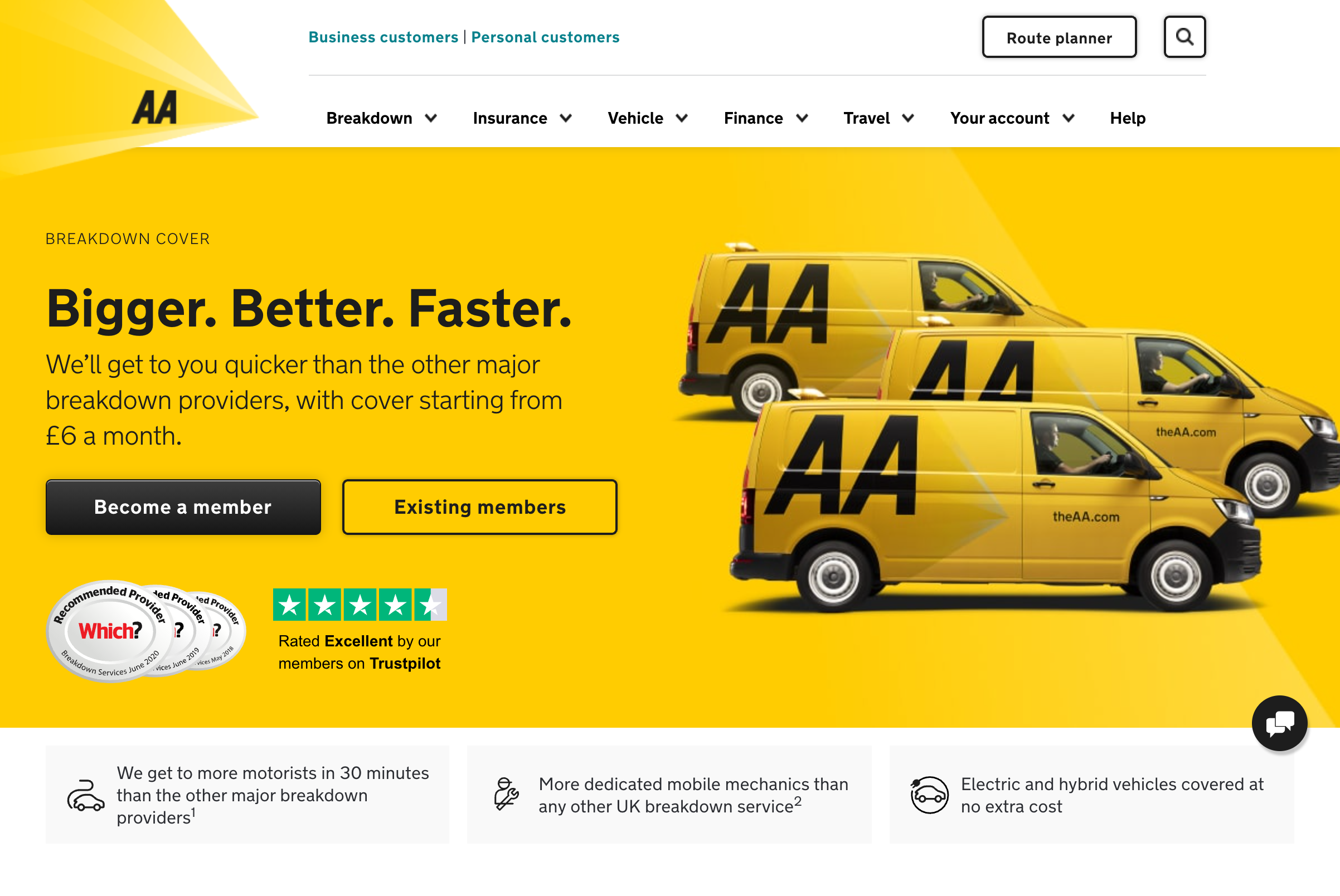
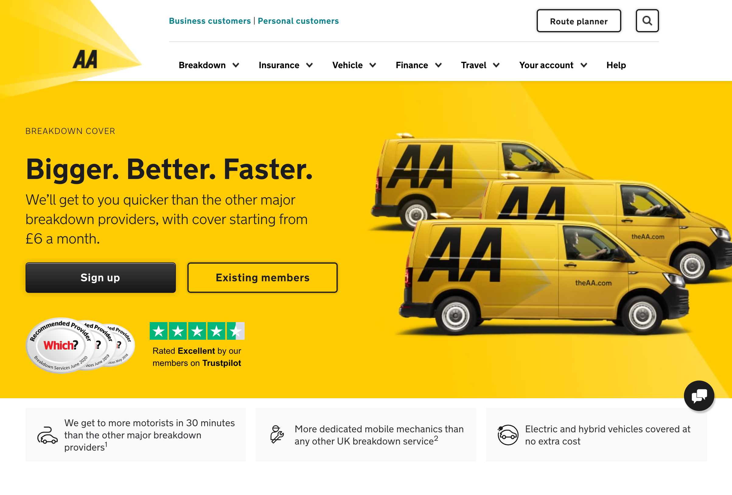
To address this, I initiated a series of user testing sessions and analysed quantitative data to understand user behaviour and preferences. Based on the insights gathered, I developed multiple versions of the CTA copy that better reflected the language used by users during testing and their desire for more information before making a commitment.
I organised a content workshop to critique these versions and explore potential alternatives. In collaboration with the Conversion Rate Optimisation (CRO) team, a detailed test plan was created, outlining the different versions of the CTA copy and the criteria for measuring success.
Solution
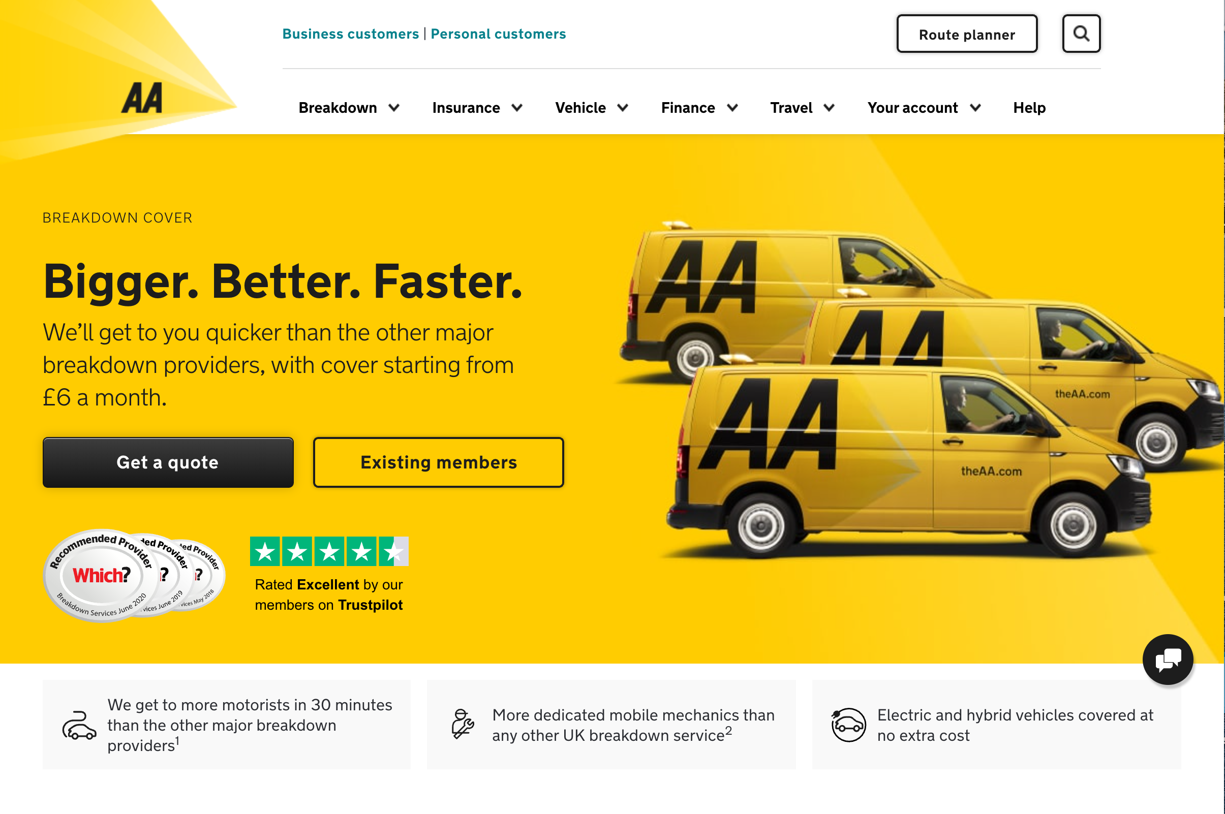
After rigorous testing, the CTA copy that resonated most with users was selected. This version was less committal and more informative, encouraging users to enter the sales journey by providing clarity on what to expect next.
Result
The new CTA copy significantly improved user engagement, resulting in a 5.49% increase in product conversion. This uplift not only translated into £6 million in additional revenue for The AA but also demonstrated a better understanding of user needs, as evidenced by the reduced selection of other CTAs on the page.
Screenshots
Winning CTA copy – “Get a quote”
Alternative CTA copy tested
More case studies
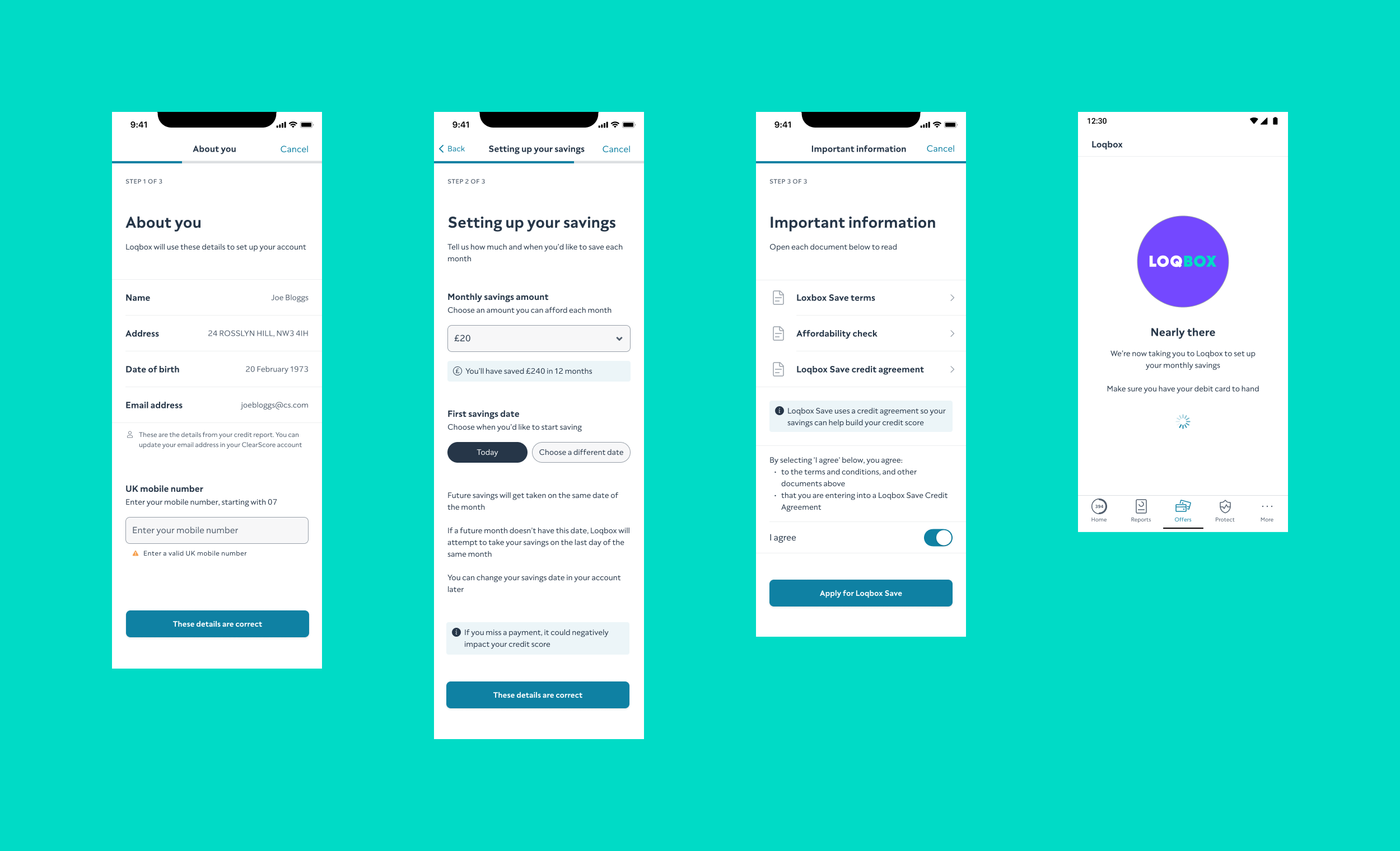
Optimising the Loqbox journey on ClearScore
Improved the Loqbox journey on ClearScore, which was initially underperforming, by simplifying the application process and enhancing user understanding.
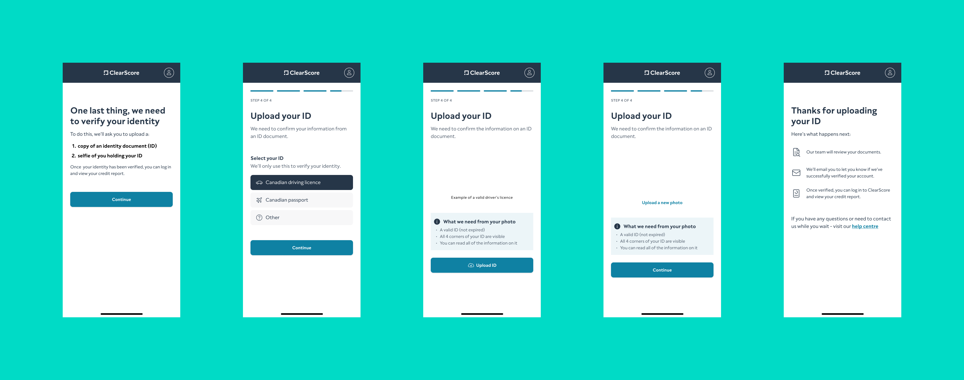
Refining onboarding for ClearScore Canada
Refined the onboarding flow for ClearScore Canada, making it more intuitive for the local user base and improving completion rates.
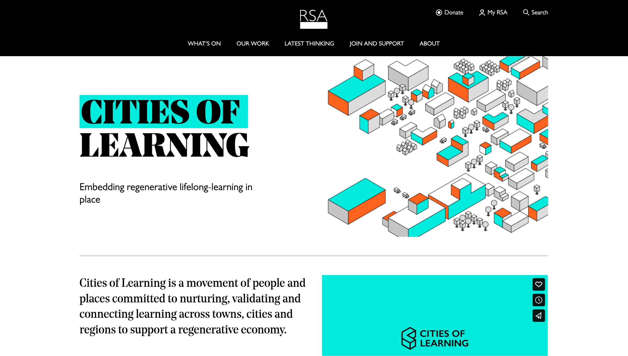
Revamping the Cities of Learning website for The RSA
Led a comprehensive website redesign for The RSA’s Cities of Learning, identifying user groups and creating tailored content to enhance user experience.
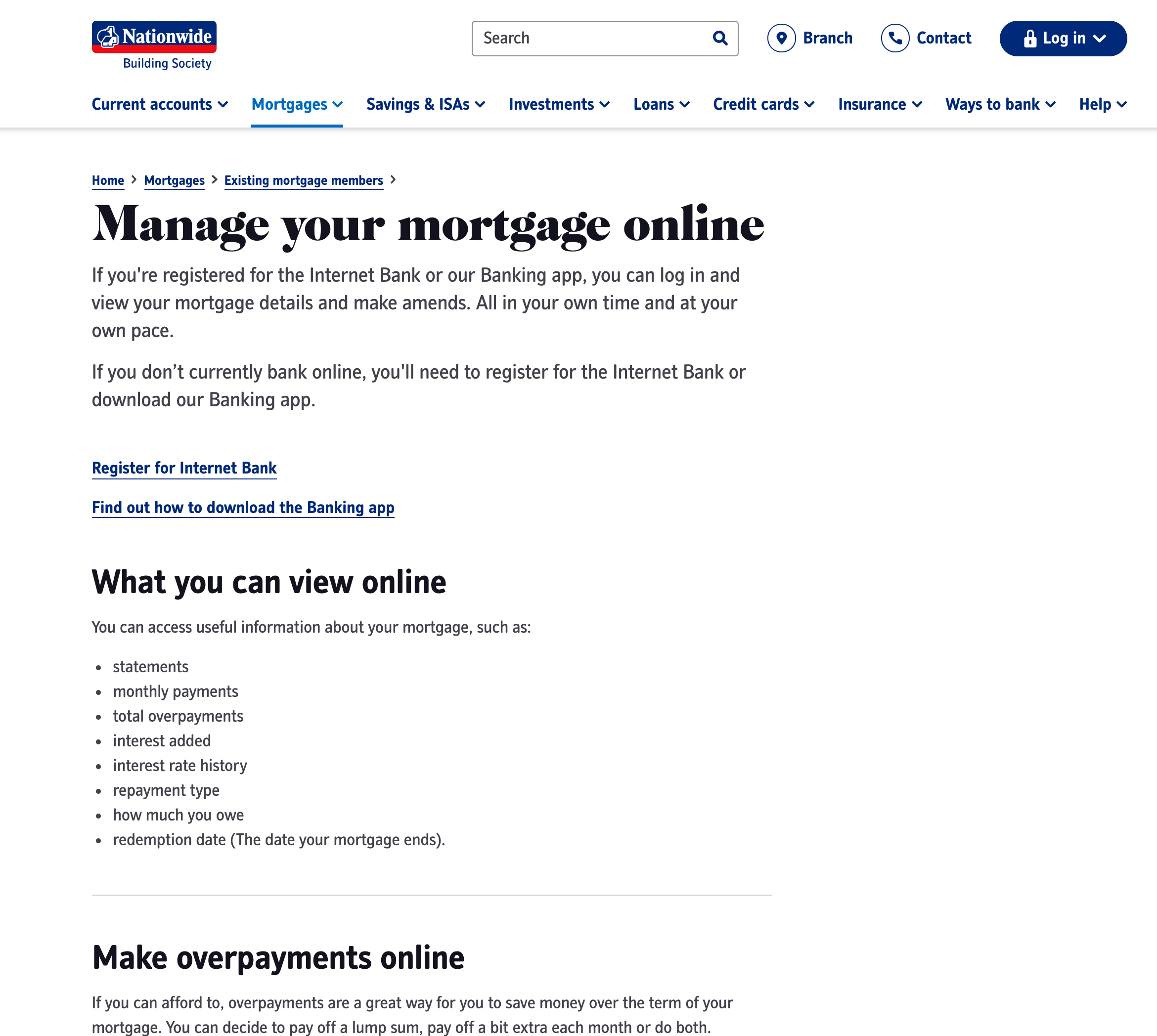
Creating a comprehensive support content framework
Developed a data-driven support content framework for Nationwide Building Society’s website, reducing call centre load and improving user experience.

